" height="23.879852418055904px" id="HtwvjeLrT" transform="translate(17.097 0)" width="4.615140699544952px"/><path d="M 4.484 0.478 C 5.532 0.114 6.651 -0.015 7.758 0.001 C 8.764 0.017 9.775 0.162 10.712 0.531 C 11.472 0.831 12.173 1.291 12.724 1.901 C 13.275 2.511 13.671 3.249 13.922 4.03 C 14.238 5.009 14.339 6.047 14.334 7.075 C 14.334 10.66 14.334 14.25 14.334 17.835 C 14.361 18.134 14.12 18.429 13.81 18.429 C 12.825 18.434 11.846 18.434 10.862 18.429 C 10.578 18.429 10.364 18.188 10.305 17.926 C 10.15 17.225 10.006 16.524 9.856 15.828 L 9.69 15.828 C 9.444 16.406 9.117 16.957 8.679 17.412 C 8.042 18.092 7.186 18.546 6.276 18.723 C 5.377 18.894 4.441 18.851 3.558 18.6 C 2.542 18.311 1.627 17.68 1.017 16.818 C 0.305 15.839 0.005 14.624 0 13.431 L 0 13.362 C 0.005 12.217 0.294 11.056 0.92 10.087 C 1.487 9.204 2.311 8.503 3.242 8.022 C 4.741 7.241 6.458 6.989 8.133 7.011 C 8.668 7.016 9.203 7.048 9.727 7.155 C 9.733 6.283 9.722 5.363 9.315 4.571 C 9.058 4.046 8.566 3.65 7.994 3.522 C 7.336 3.372 6.613 3.41 6.009 3.731 C 5.42 4.046 5.024 4.63 4.81 5.25 C 4.719 5.48 4.692 5.753 4.516 5.935 C 4.393 6.069 4.195 6.096 4.024 6.063 C 3.028 5.892 2.033 5.721 1.038 5.55 C 0.894 5.523 0.749 5.475 0.653 5.363 C 0.508 5.207 0.487 4.983 0.54 4.785 C 0.813 3.693 1.364 2.661 2.178 1.874 C 2.825 1.243 3.628 0.777 4.484 0.483 Z M 7.518 9.579 C 6.715 9.734 5.928 10.125 5.415 10.777 C 4.848 11.494 4.66 12.452 4.767 13.346 C 4.837 13.961 5.104 14.576 5.602 14.961 C 6.292 15.491 7.293 15.523 8.058 15.138 C 8.796 14.753 9.214 13.966 9.433 13.196 C 9.77 12.024 9.727 10.799 9.727 9.595 C 9 9.461 8.245 9.44 7.518 9.584 Z" fill="rgb(27, 139, 209)" height="18.82598481003613px" id="JDTxRl8t9" transform="translate(0 5.44)" width="14.336164758473098px"/><path d="M 5.118 0.528 C 7.076 -0.264 9.403 -0.178 11.249 0.871 C 12.56 1.609 13.588 2.797 14.246 4.14 C 15.091 5.841 15.391 7.768 15.353 9.651 C 15.337 9.913 15.396 10.186 15.305 10.438 C 15.225 10.646 14.995 10.764 14.781 10.753 C 11.463 10.753 8.151 10.753 4.834 10.753 C 4.925 11.839 5.091 12.958 5.642 13.915 C 6 14.541 6.616 15.034 7.338 15.151 C 8.109 15.274 8.954 15.162 9.591 14.686 C 10.11 14.295 10.425 13.691 10.591 13.075 C 10.645 12.888 10.672 12.679 10.821 12.546 C 10.944 12.433 11.126 12.428 11.287 12.465 C 12.346 12.701 13.406 12.936 14.465 13.172 C 14.61 13.204 14.759 13.252 14.85 13.37 C 14.952 13.493 14.957 13.669 14.909 13.814 C 14.47 15.157 13.689 16.409 12.582 17.297 C 11.731 17.987 10.698 18.437 9.628 18.651 C 7.772 19.02 5.754 18.817 4.101 17.853 C 2.667 17.035 1.57 15.703 0.912 14.194 C 0.42 13.075 0.147 11.866 0.045 10.646 C -0.072 9.169 0.035 7.671 0.42 6.237 C 0.794 4.852 1.442 3.53 2.4 2.455 C 3.143 1.615 4.069 0.935 5.112 0.512 Z M 7.001 3.803 C 6.412 4.044 5.963 4.541 5.658 5.087 C 5.209 5.895 5 6.815 4.882 7.725 C 6.808 7.725 8.735 7.725 10.661 7.725 C 10.581 6.949 10.447 6.179 10.163 5.451 C 9.96 4.937 9.666 4.434 9.222 4.086 C 8.606 3.6 7.723 3.514 7.001 3.808 Z" fill="rgb(27, 139, 209)" height="18.823406191056527px" id="K5K0gTvxt" transform="translate(23.904 5.432)" width="15.357406115113633px"/><path d="M 5.803 0.147 C 7.044 -0.056 8.323 -0.056 9.559 0.195 C 10.538 0.398 11.485 0.8 12.25 1.452 C 12.924 2.02 13.427 2.769 13.754 3.587 C 14.166 4.615 14.315 5.722 14.326 6.824 C 14.331 10.495 14.326 14.171 14.326 17.841 C 14.358 18.157 14.096 18.457 13.775 18.446 C 12.796 18.446 11.817 18.451 10.837 18.446 C 10.549 18.446 10.34 18.178 10.292 17.911 C 10.142 17.221 9.997 16.53 9.853 15.845 C 9.794 15.845 9.741 15.845 9.682 15.845 C 9.291 16.793 8.633 17.654 7.745 18.178 C 6.675 18.82 5.364 18.954 4.155 18.751 C 2.983 18.558 1.875 17.943 1.142 17.001 C 0.511 16.204 0.158 15.214 0.045 14.214 C -0.067 13.197 0.024 12.154 0.377 11.19 C 0.661 10.42 1.116 9.714 1.704 9.141 C 2.715 8.141 4.069 7.552 5.444 7.263 C 6.3 7.081 7.178 7.012 8.05 7.022 C 8.606 7.028 9.168 7.055 9.719 7.167 C 9.725 6.429 9.719 5.674 9.473 4.968 C 9.318 4.508 9.034 4.069 8.617 3.801 C 8.135 3.491 7.536 3.416 6.98 3.459 C 6.455 3.496 5.936 3.7 5.551 4.064 C 5.128 4.454 4.872 4.995 4.716 5.54 C 4.663 5.722 4.583 5.92 4.411 6.022 C 4.267 6.113 4.09 6.091 3.93 6.059 C 2.935 5.883 1.934 5.722 0.939 5.535 C 0.629 5.476 0.452 5.134 0.527 4.839 C 0.762 3.86 1.228 2.924 1.902 2.169 C 2.897 1.046 4.337 0.393 5.803 0.152 Z M 6.996 9.719 C 6.327 9.933 5.712 10.34 5.31 10.923 C 4.802 11.651 4.652 12.582 4.781 13.448 C 4.872 14.074 5.177 14.695 5.717 15.054 C 6.632 15.653 7.986 15.482 8.697 14.636 C 9.152 14.112 9.393 13.438 9.537 12.769 C 9.762 11.726 9.725 10.655 9.725 9.596 C 8.826 9.436 7.873 9.436 6.996 9.719 Z" fill="rgb(27, 139, 209)" height="18.838576068886926px" id="f4F5ibwub" transform="translate(54.332 5.434)" width="14.328691748748762px"/><path d="M 0.582 0.067 C 0.764 -0.019 0.967 0.002 1.165 0.002 C 2.203 0.002 3.241 0.002 4.274 0.002 C 4.499 -0.014 4.734 0.109 4.814 0.323 C 5.531 2.052 6.243 3.78 6.96 5.508 C 7.013 5.508 7.072 5.508 7.126 5.508 C 7.832 3.823 8.549 2.137 9.255 0.452 C 9.325 0.216 9.518 -0.003 9.78 0.008 C 10.887 0.008 11.995 0.008 13.097 0.008 C 13.322 0.008 13.546 0.104 13.675 0.286 C 13.819 0.479 13.83 0.751 13.728 0.971 C 12.471 3.603 11.198 6.23 9.946 8.863 C 11.262 11.57 12.562 14.283 13.878 16.99 C 13.975 17.172 14.028 17.386 13.964 17.584 C 13.884 17.868 13.595 18.055 13.306 18.05 C 12.22 18.05 11.128 18.05 10.042 18.05 C 9.876 18.05 9.694 18.034 9.56 17.921 C 9.432 17.825 9.389 17.659 9.325 17.515 C 8.549 15.722 7.773 13.93 6.992 12.143 C 6.949 12.143 6.864 12.143 6.826 12.143 C 6.04 13.999 5.258 15.851 4.477 17.707 C 4.408 17.905 4.215 18.055 4.001 18.044 C 2.984 18.044 1.968 18.044 0.957 18.044 C 0.711 18.044 0.438 18.055 0.24 17.889 C -0.006 17.702 -0.065 17.333 0.074 17.06 C 1.395 14.32 2.722 11.581 4.044 8.841 C 2.824 6.3 1.604 3.764 0.389 1.222 C 0.304 1.04 0.186 0.853 0.197 0.644 C 0.197 0.393 0.357 0.158 0.582 0.061 Z" fill="rgb(27, 139, 209)" height="18.04990672720011px" id="iagVulc1A" transform="translate(39.654 5.824)" width="13.991851840162212px"/><path d="M 5.849 0.557 C 5.833 0.258 6.101 -0.015 6.401 0.001 C 7.31 0.001 8.22 0.001 9.129 0.001 C 9.424 -0.005 9.675 0.263 9.664 0.552 C 9.664 2.36 9.664 4.163 9.664 5.972 C 11.446 5.972 13.228 5.972 15.01 5.972 C 15.293 5.977 15.475 6.234 15.55 6.486 L 15.55 9.027 C 15.48 9.279 15.299 9.535 15.01 9.535 C 13.228 9.546 11.446 9.535 9.664 9.535 C 9.664 11.338 9.664 13.142 9.664 14.945 C 9.68 15.239 9.424 15.512 9.124 15.507 C 8.204 15.507 7.278 15.507 6.358 15.507 C 6.069 15.507 5.828 15.234 5.849 14.945 C 5.849 13.142 5.849 11.338 5.849 9.535 C 4.089 9.535 2.329 9.535 0.568 9.535 C 0.274 9.551 0.001 9.305 0.001 9.006 C 0.001 8.182 0.001 7.363 0.001 6.539 C -0.02 6.25 0.226 5.972 0.52 5.972 C 2.297 5.967 4.073 5.972 5.849 5.972 C 5.849 4.163 5.849 2.36 5.849 0.557 Z" fill="rgb(27, 139, 209)" height="15.506656007879883px" id="SMFifD6Ft" transform="translate(71.45 7.094)" width="15.550007016939617px"/><path d="M 5.804 0.054 C 6.831 -0.047 7.869 -0.01 8.88 0.194 C 9.555 0.327 10.223 0.515 10.833 0.841 C 11.17 1.023 11.502 1.274 11.641 1.644 C 11.866 2.211 11.861 2.837 11.834 3.436 C 11.695 5.303 11.085 7.149 10.009 8.69 C 9.517 9.397 8.939 10.044 8.297 10.616 C 7.891 10.986 7.479 11.36 6.986 11.617 C 6.767 11.724 6.51 11.82 6.264 11.756 C 6.061 11.713 5.906 11.547 5.809 11.371 C 5.686 11.119 5.75 10.836 5.847 10.59 C 6.071 10.033 6.43 9.552 6.713 9.027 C 7.35 7.877 7.912 6.673 8.276 5.405 C 8.399 4.902 8.538 4.378 8.436 3.859 C 8.388 3.591 8.147 3.42 7.907 3.329 C 7.382 3.126 6.815 3.083 6.259 3.051 C 5.023 3.003 3.787 3.115 2.572 3.324 C 2.005 3.415 1.443 3.586 0.86 3.58 C 0.635 3.58 0.389 3.538 0.218 3.383 C -0.007 3.179 -0.066 2.821 0.079 2.553 C 0.282 2.179 0.646 1.927 0.988 1.697 C 2.438 0.788 4.102 0.226 5.809 0.06 Z" fill="rgb(27, 139, 209)" height="11.776806246084334px" id="bx4pe8kX2" transform="translate(53.619 28.4)" width="11.846800103000305px"/><path d="M 0.229 0.178 C 0.459 -0.041 0.812 -0.036 1.091 0.076 C 1.61 0.28 2.043 0.649 2.476 0.991 C 5.906 3.725 9.876 5.742 14.044 7.096 C 18.02 8.391 22.172 9.113 26.345 9.37 C 30.438 9.616 34.553 9.424 38.603 8.798 C 41.113 8.407 43.601 7.845 46.025 7.075 C 47.924 6.47 49.786 5.726 51.546 4.79 C 51.953 4.587 52.37 4.351 52.836 4.335 C 53.317 4.314 53.719 4.811 53.628 5.277 C 53.569 5.63 53.355 5.935 53.141 6.208 C 52.617 6.845 51.974 7.369 51.332 7.883 C 50.466 8.562 49.551 9.183 48.598 9.75 C 45.297 11.708 41.632 13.003 37.886 13.795 C 35.051 14.4 32.156 14.673 29.261 14.742 L 28.411 14.742 C 26.971 14.699 25.532 14.624 24.103 14.469 C 18.683 13.881 13.327 12.276 8.651 9.44 C 5.751 7.679 3.129 5.443 1.01 2.789 C 0.631 2.291 0.251 1.772 0.063 1.168 C -0.033 0.841 -0.049 0.429 0.229 0.183 Z" fill="rgb(27, 139, 209)" height="14.742105450521649px" id="nNPxdjXa3" transform="translate(5.432 29.405)" width="53.640713627001496px"/></g></svg>)
FitFuel: Designed for Returns
FitFuel is a fictional AI-enhanced fitness app built as the capstone project for Design Lab's AI for UX Design course. I led this as a solo design exercise run to a real four-week production cadence: research direction, stakeholder research, a decision-ready design package, and this case study. My role covered research synthesis, persona and journey work, opportunity prioritization, one prototyped flow, and an accessibility audit, with Claude used throughout as a structured working partner rather than a content generator.
The Goal
Feature Engagment = Downstream Impact
Fitness apps have two working models: cheap self-tracking tools that log what you did, or expensive human coaching that tells you what to do next. Neither is where FitFuel started. The open question was narrower and less comfortable: not "what feature should we build," but "who is actually underserved, and can we prove it before we design for them." Three persona hypotheses came out of the design brief: a time-constrained professional, a returning routine builder, and an edge-case user with access needs. Only two survived contact with the interview data. The professional persona was cut for thin evidentiary support, a finding I documented rather than quietly patched over. What the surviving research pointed to instead was sharper than any of the three original hypotheses: across the journey map, the single highest-risk moment for the Returning Routine Builder wasn't a missing feature anywhere in the app. It was how the product handled the act of coming back after a lapse. No competitor in the landscape scan designs for that specific moment. That gap, not a feature request, became the central design problem.
Product Fit
Discovery Moments
I ran this as an AI-augmented workflow with a fixed division of labor: Claude for synthesis speed, breadth, and structure; me for framing, evidence interpretation, and every claim that shipped in a stakeholder-facing document. Concretely: Every fact-shaped claim (market, competitive, or behavioral) was tagged Validated, Partially Validated, Hypothesis, or Synthesis, and no claim was called Validated without two independent sources. This wasn't a formatting choice; it changed which opportunity areas survived. Two opportunity areas that looked promising on first pass got cut on the evidence, not on gut feel: an accountability middle tier, because the competitive scan challenged the premise it was solving for and the interview data showed aggressive accountability notifications as a documented deletion trigger rather than a retention lever; and a GLP-1 fitness bridge, for having zero primary-transcript support. Claude drafted first-pass syntheses, personas, and journey map content from interview transcripts and market research. I reviewed every synthesis-tagged conclusion against the source transcripts before it was allowed into a document, and re-framed at least one finding directly: research on AI trust showed users don't need algorithmic explainability, they need override ability and a default-to-gentler posture under uncertainty, which is a different (and more actionable) design target than "make the AI's reasoning legible."

Approach
Understanding the Pain Points
I ran a design sprint with users ranging from daily active to once a month, advanced to beginner. I brought the engineering team along to hear the feedback directly. As we walked through campaign creation, I had the participants explain their workflow, end goal, and how they thought Odyssey worked. This revealed a general misunderstanding of some of the UI. As the engineers clarified terms and features, light bulbs went off as participants began to understand. With valuable insights uncovered, we saw a clear path to improvement. The whole activity took about an hour and a half.
Design Process
Simplifying Authoring
Every field and dropdown in the UI was needed, so cutting options to simplify would break live campaigns. Also, I couldn't reshuffle the layout, forcing advanced users to relearn it. So rather than revamping the original creation path entirely, I decided to put a simplified version alongside it as an easier means to the same end. For the CIF channel (aka "by the way, have you heard of {feature name}?"), this alternate was called Basic CIF, which was stripped of all optional fields. An unexpected benefit of this approach: new authors could use this path as training wheels.
Advanced Authoring
For advanced authoring, I was limited by what I could touch, so as not to break existing experiences. Even so, I used a handful of design tactics to melt away confusion across the journey. I used chunking to make the number of fields seem less overwhelming. I suggested autosave, allowing users to walk away at any time. I also audited copy to remove engineer-y terms and make the language more consistent.

Choose Campaign Type

Configure Triggering Mechanism

Select User Target
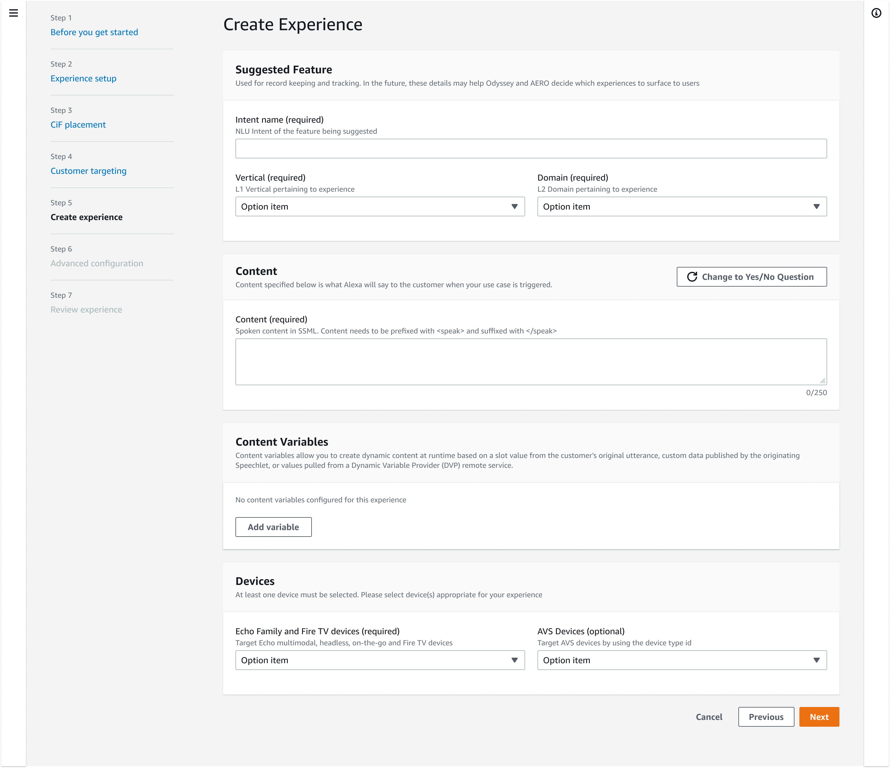
Author the Experience
Choose Campaign Type
Configure Triggering Mechanism
Select User Target
Author the Experience
Choose Campaign Type
Configure Triggering Mechanism
Select User Target
Author the Experience
Choose Campaign Type
Configure Triggering Mechanism
Select User Target
Author the Experience
Process Continued
Further Improvements

Automating
The workflow UI was very form-field intensive. Instead of showing a sea of empty fields each time a campaign was created, pre-loading common inputs delivered meaningful time savings.

Templates
Marketers struggled with too many style options. Instead of making them configure everything manually, I defined a set of simple templates with pre-loaded content tailored to common goals.

Copy Audit
Copy throughout the tool was filled with developer-speak. I replaced these with plain language and clear questions, so marketers quickly understood what the tool does and what results to expect.
Process Continued
Further Improvements
Automating
The workflow UI was very form-field intensive. Instead of showing a sea of empty fields each time a campaign was created, pre-loading common inputs delivered meaningful time savings.
Templates
Marketers struggled with too many style options. Instead of making them configure everything manually, I defined a set of simple templates with pre-loaded content tailored to common goals.
Copy Audit
Copy throughout the tool was filled with developer-speak. I replaced these with plain language and clear questions, so marketers quickly understood what the tool does and what results to expect.

Impact
These internal tools at Amazon that drove a 160% increase in global campaigns, 208% YoY growth, and cut campaign creation time from months to as little as 2 weeks.
Impact
These internal tools at Amazon that drove a 160% increase in global campaigns, 208% YoY growth, and cut campaign creation time from months to as little as 2 weeks.
Impact
These internal tools at Amazon that drove a 160% increase in global campaigns, 208% YoY growth, and cut campaign creation time from months to as little as 2 weeks.
Copyright © 2025 Jesse Bones. All Rights Reserved. All content, designs, and images on this website are the property of Jesse Bones and respective clients. Unauthorized use, reproduction, or distribution of any materials without explicit permission is prohibited.
Copyright © 2025 Jesse Bones. All Rights Reserved. All content, designs, and images on this website are the property of Jesse Bones and respective clients. Unauthorized use, reproduction, or distribution of any materials without explicit permission is prohibited.
Copyright © 2025 Jesse Bones. All Rights Reserved. All content, designs, and images on this website are the property of Jesse Bones and respective clients. Unauthorized use, reproduction, or distribution of any materials without explicit permission is prohibited.
Copyright © 2025 Jesse Bones. All Rights Reserved. All content, designs, and images on this website are the property of Jesse Bones and respective clients. Unauthorized use, reproduction, or distribution of any materials without explicit permission is prohibited.